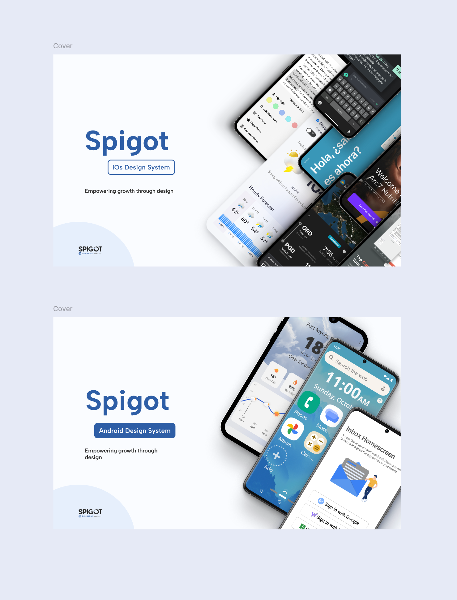
Product Design · Cross-Platform Design System

One Language,
Thirty Apps.

Building a unified global design system for 30 iOS and Android apps — with 2 designers, in 2 months, from first principles.

Role
Mobile UX Lead
Timeline
Jun – Jul 2024
Platforms
iOS & Android
Team
2 Designers

When we started, 30+ apps shared a product org — and nothing else.

2 separate design systems — one per platform, never speaking to each other
5 designers on the team, only 2 actively maintaining design files
0 shared token vocabulary between iOS, Android, and engineering
01 · The Trigger

When two worlds had to become one

When I joined, there was no design system at all. Every app ran on its own styles and fonts — even within the same SF family, each product made its own choices. No shared philosophy. No governing logic.

In the second year, we recognized this was unsustainable. My co-designer and I each built separate systems — one for iOS, one for Android. It worked, in isolation. But it was still two languages operating in two separate rooms.

Then the strategy shifted. The iOS and Android dev teams were now expected to collaborate on cross-platform apps. Suddenly, our two separate design systems weren't just inefficient — they were an architectural liability. Adopting either one would bake platform-specific assumptions into cross-platform products.

We had one choice: rebuild from a shared foundation.

Old design system — iOS and Android
02 · The Reframe

Not a missing system.
A missing shared language.

"An iOS designer said 'primary blue'. A developer said 'surface container'. An Android designer said 'theme color'. They meant the same thing — and none of them knew it."

The root cause wasn't that we lacked a design system. We had two. The root cause was that every discipline had developed its own shorthand. When teams finally had to collaborate, the translation overhead was enormous.

A new cross-platform design system would only solve the problem if it gave everyone a single, unambiguous vocabulary. That meant token architecture wasn't a technical question. It was a communication design problem.

screen.background.neutral-base button.background.primary-bold status.error-base line.neutral-soft state.disabled-70
03 · The Hardest Call

Two philosophies.
Three weeks. One token system.

This was the most contested part of the project. My co-designer and I each developed a naming architecture independently, then spent nearly three weeks debating, researching, and aligning with engineering. We studied Material 3, Atlassian's token library, and W3C token formats.

The fundamental question: should a token name describe where it's used, or how it looks?

Idea 1 — Element-anchored
Type · Intent · Prominence
-type What element this color belongs to (surface, button, outline…)
-intent Semantic purpose (neutral, theme, warning, error…)
-prominence Hierarchy level (primary, secondary, tertiary)
-state Interaction state (focused, pressed, disabled…)
surface.theme.primary.light
button.error.primary.pressed
Color vocabulary too narrow for 30+ diverse app styles
Why we didn't adopt Material 3
M3's strengths
  • High developer familiarity — engineers already knew container / surface naming
  • Excellent reuse rates; fewer tokens to maintain
  • Well-documented, industry-proven structure
Why it didn't fit our context
  • Container/surface naming compresses color vocabulary into too few slots — insufficient for 30 apps with distinct visual identities
  • M3's semantic layer assumes a single brand palette. Our apps do not share a brand.
  • Designers found token names non-descriptive outside Material's own ecosystem
The Final Architecture
Primitive layer
Raw color values with neutral names: red-50, blue-300, neutral-700. Never used directly in product code — they are the source of truth semantic tokens reference.
Semantic layer

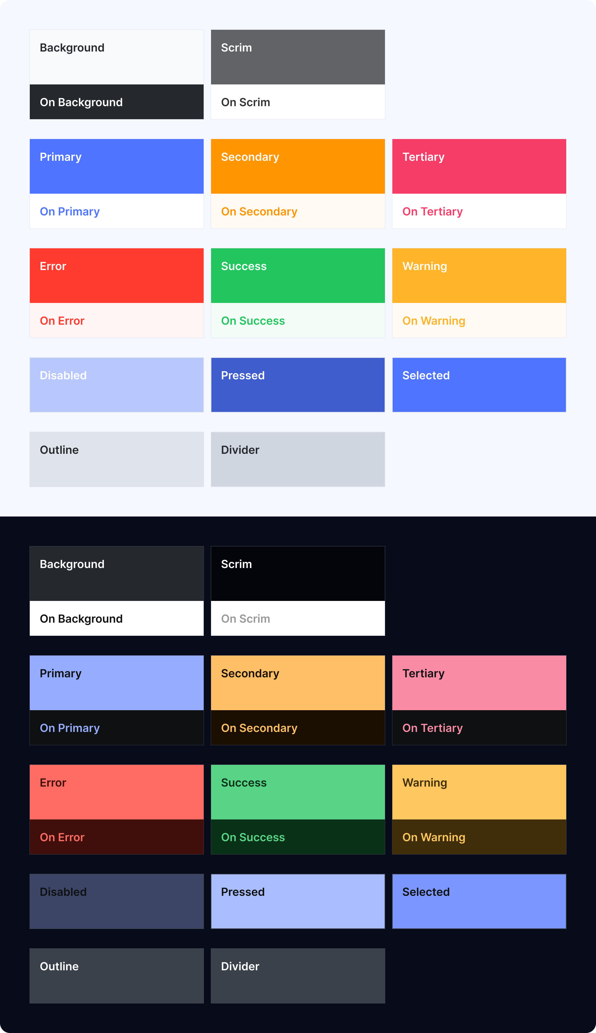
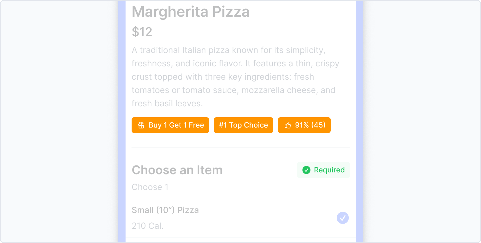
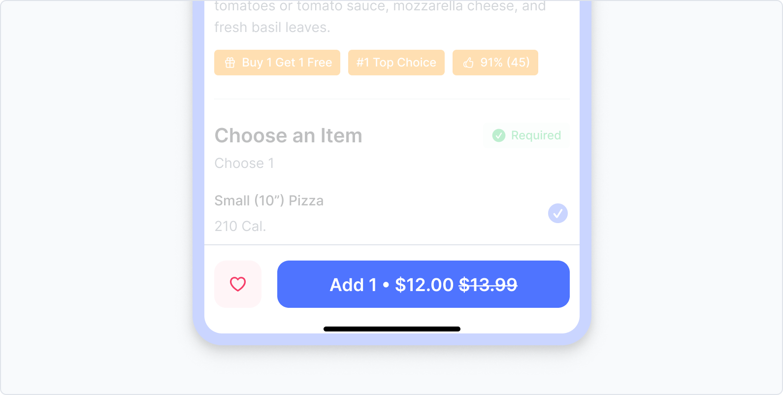
Contextual tokens named by purpose, not hue — called Local Colors. Each token communicates meaning to designers and developers without guesswork, and maps directly to both light and dark themes.

BackgroundOn BackgroundScrimOn Scrim PrimaryOn PrimarySecondaryOn SecondaryTertiaryOn Tertiary ErrorOn ErrorSuccessOn SuccessWarningOn Warning DisabledPressedSelectedOutlineDivider
One system, both platforms
Rather than separate iOS and Android token sets, we output one unified token library. Engineering on both platforms references identical color vocabulary.
Deliberate simplification
After engineering alignment, the Idea 2 structure was intentionally pruned. Dev's priority — high reuse rate — was honoured. Our priority — readable semantics — was preserved.
03b · Local Colors

Semantic tokens
named by purpose.

Local Colors are semantic tokens that represent how colors are used in context throughout the product interface. Instead of defining a specific hue, each Local Color communicates purpose and meaning.

The naming rules follow a consistent hierarchy: surface tokens (Background, Scrim) anchor the canvas, role tokens (Primary, Secondary, Tertiary) carry brand intent, and status tokens (Error, Success, Warning) communicate state. Every token has a paired On {Token} for text and icons placed on top of it.

This structure keeps color usage consistent and meaningful across all 22 apps — designers and developers reference the same vocabulary whether they're building for light mode, dark mode, iOS, or Android.
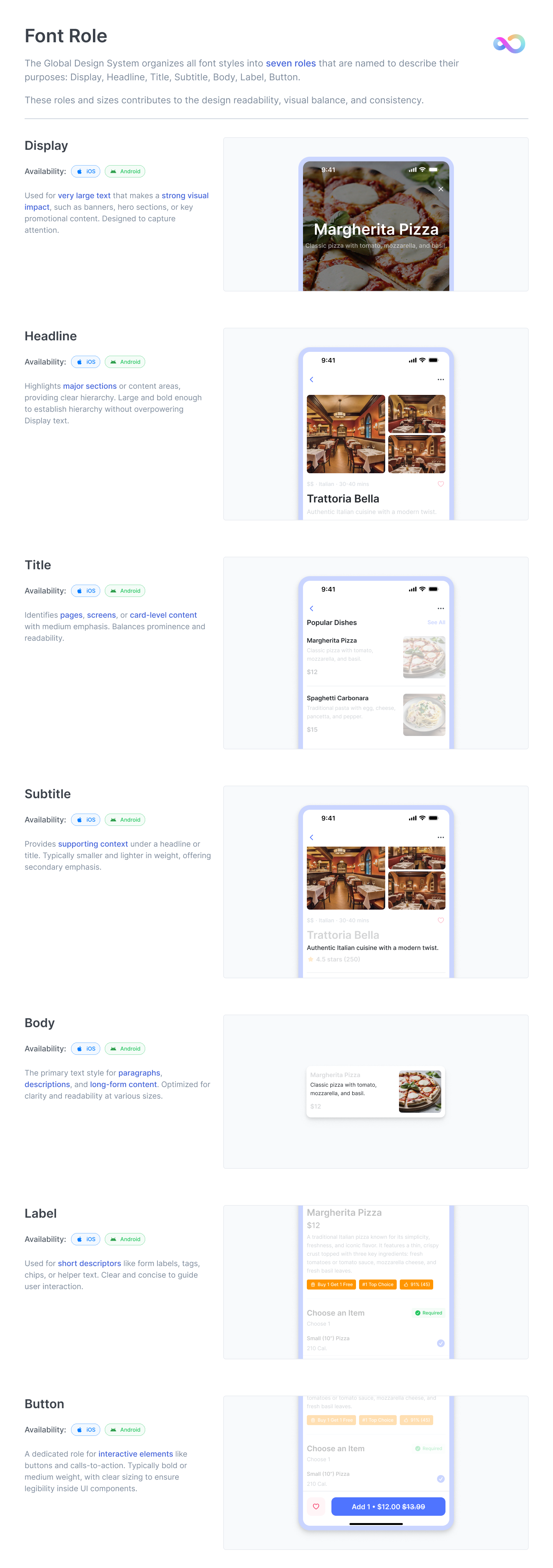
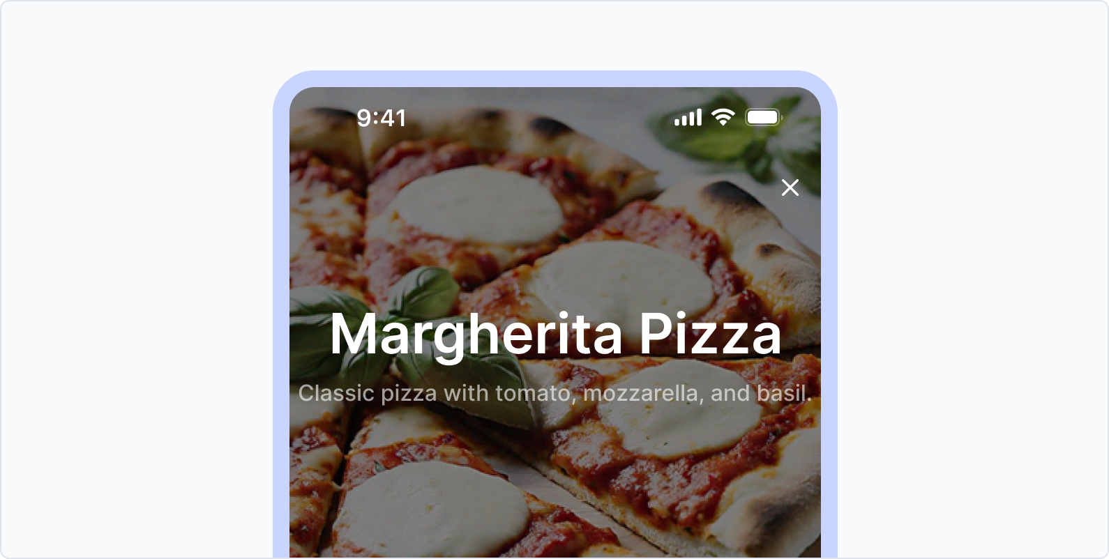
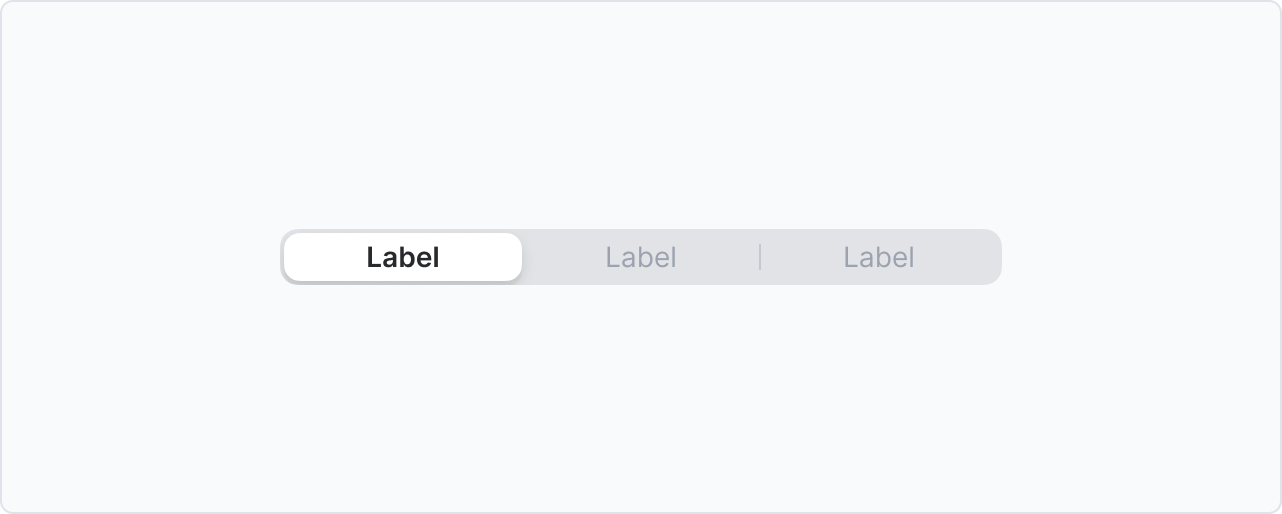
Background On Background Scrim On Scrim Primary On Primary Secondary On Secondary Tertiary On Tertiary Error On Error Success On Success Warning On Warning Disabled Pressed Selected Outline Divider
Local Color Structure — full token set
04 · Font Role System

Not a type scale.
A set of roles.

Cross-platform typography is usually solved by mapping font sizes. We took a different approach: instead of specifying what text should look like, we specified what it should do.

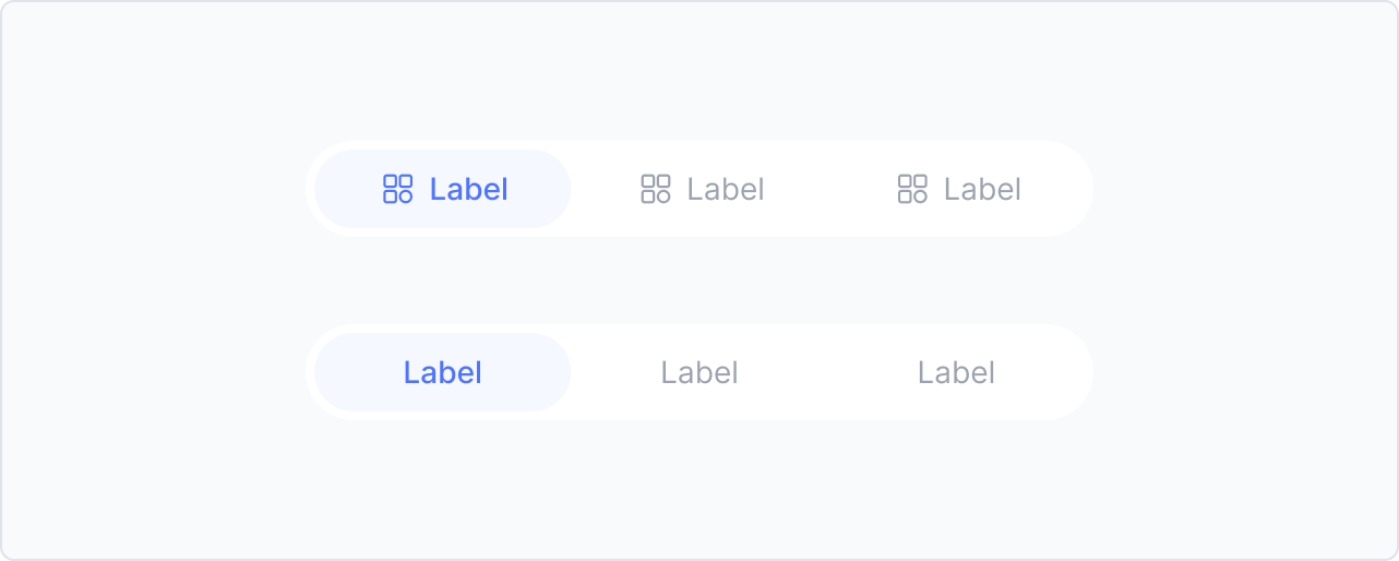
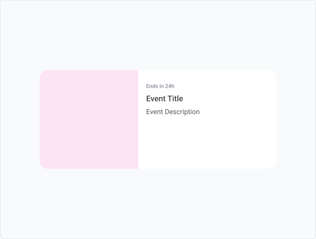
The system defines seven roles: Display, Headline, Title, Subtitle, Body, Label, and Button. Each carries a clear functional mandate. Both iOS and Android use the same role names — but render them with platform-appropriate font families underneath.

A designer building a new app doesn't start by asking "17px or 18px?" They ask "is this text playing a Title role or a Headline role?" The answer is consistent across every app, every platform.

Font Role documentation — 7 roles
iOSAndroid
Display
Used for very large text that makes a strong visual impact — banners, hero sections, key promotional content. Designed to capture immediate attention.
Display role — app screenshot
iOSAndroid
Headline
Highlights major sections or content areas. Large and bold enough to establish hierarchy without competing with Display text.
Headline role
iOSAndroid
Title
Identifies pages, screens, or card-level content with medium emphasis. Balances prominence and readability.
Title role
iOSAndroid
Subtitle
Provides supporting context under a headline or title. Typically smaller and lighter in weight.
Subtitle role
iOSAndroid
Body
Primary text style for paragraphs and descriptions. Optimized for clarity at reading sizes.
Body role
iOSAndroid
Label
Used for short descriptors — form labels, tags, chips, helper text. Clear and concise.
Label role
iOSAndroid
Button
For interactive elements like buttons and CTAs. Bold or medium weight, sized for legibility inside UI components.
Button role
Why Inter?

A font that disappears into both platforms.

The obvious choices were SF Pro (iOS native) and Roboto (Android native). But using either would telegraph a platform preference — Android users notice SF Pro; iOS users notice Roboto. We needed something neutral, legible, and platform-agnostic.

Inter was chosen because its core metrics — x-height, stroke width, letter spacing, and line height — are remarkably close to both SF Pro and Roboto. Users don't notice it's a different font. They just notice the text is easy to read.

iOS Native
SF Pro
The quick brown fox jumps over the lazy dog
Line height1.5 × size
Letter spacingAuto (optical)
x-heightHigh
PlatformApple only
Apple's system font. Excellent on iOS, but restricted license — cannot be used on Android or web outside Apple's ecosystem.
Android Native
Roboto
The quick brown fox jumps over the lazy dog
Line height1.5 × size
Letter spacing0–0.03em
x-heightHigh
PlatformAndroid / Open
Google's system font. Slightly wider letterforms. Reads as "Android" to iOS users — breaks platform neutrality.
05 · Platform Tensions

Unified tokens.
Respected conventions.

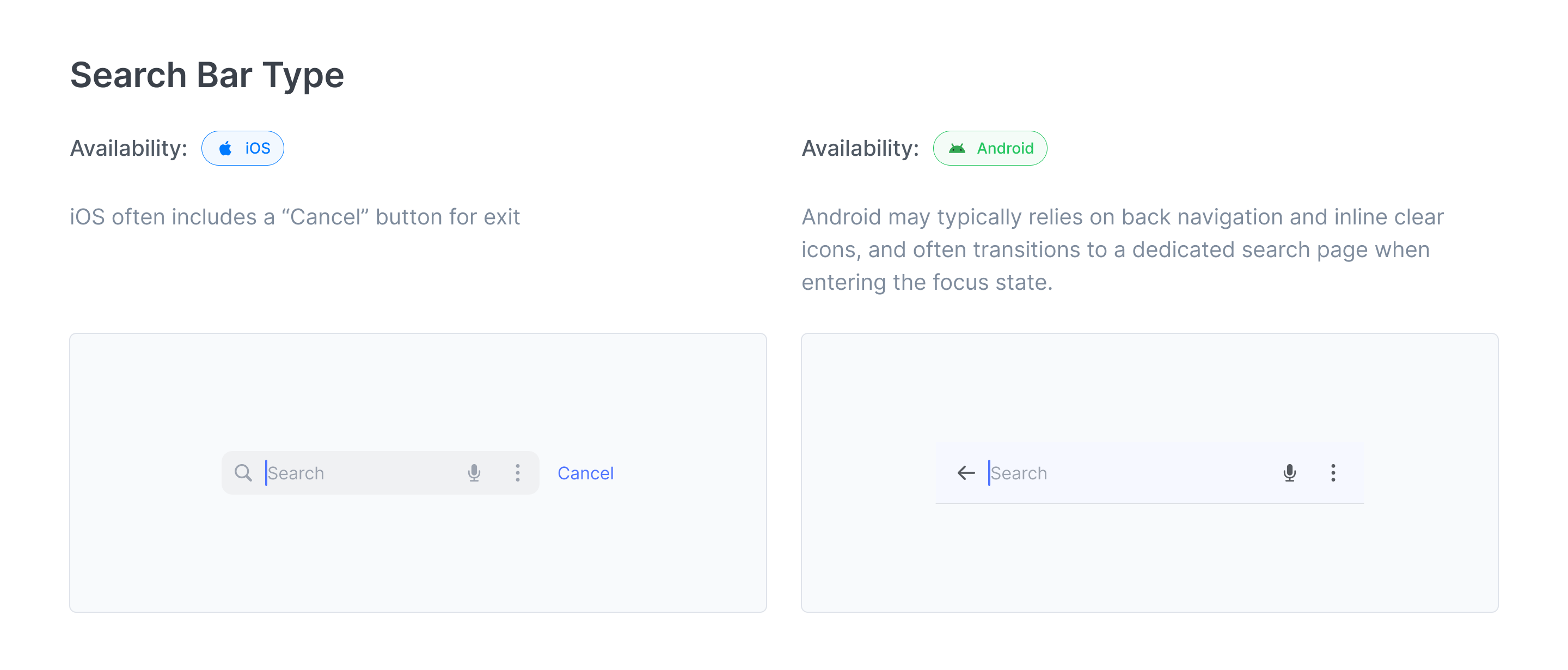
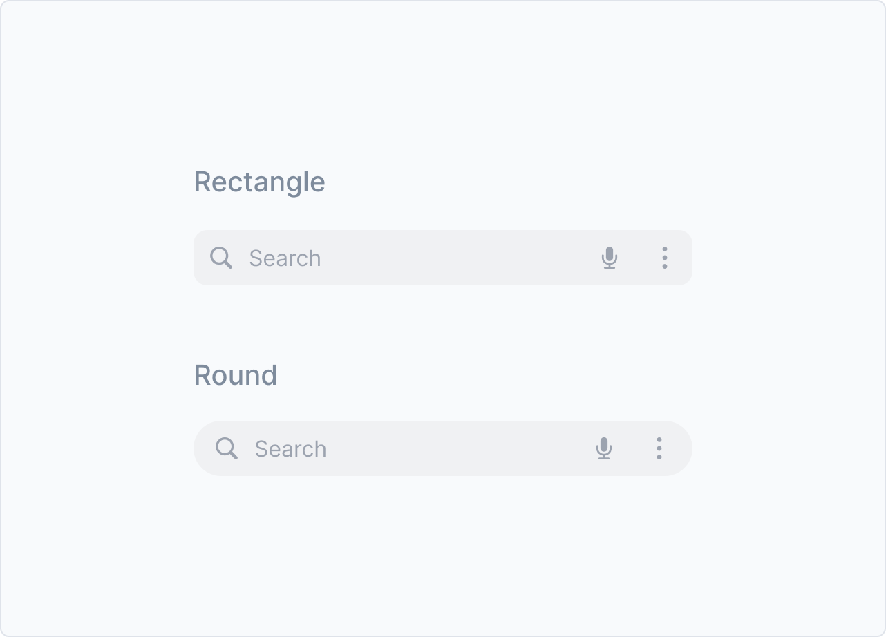
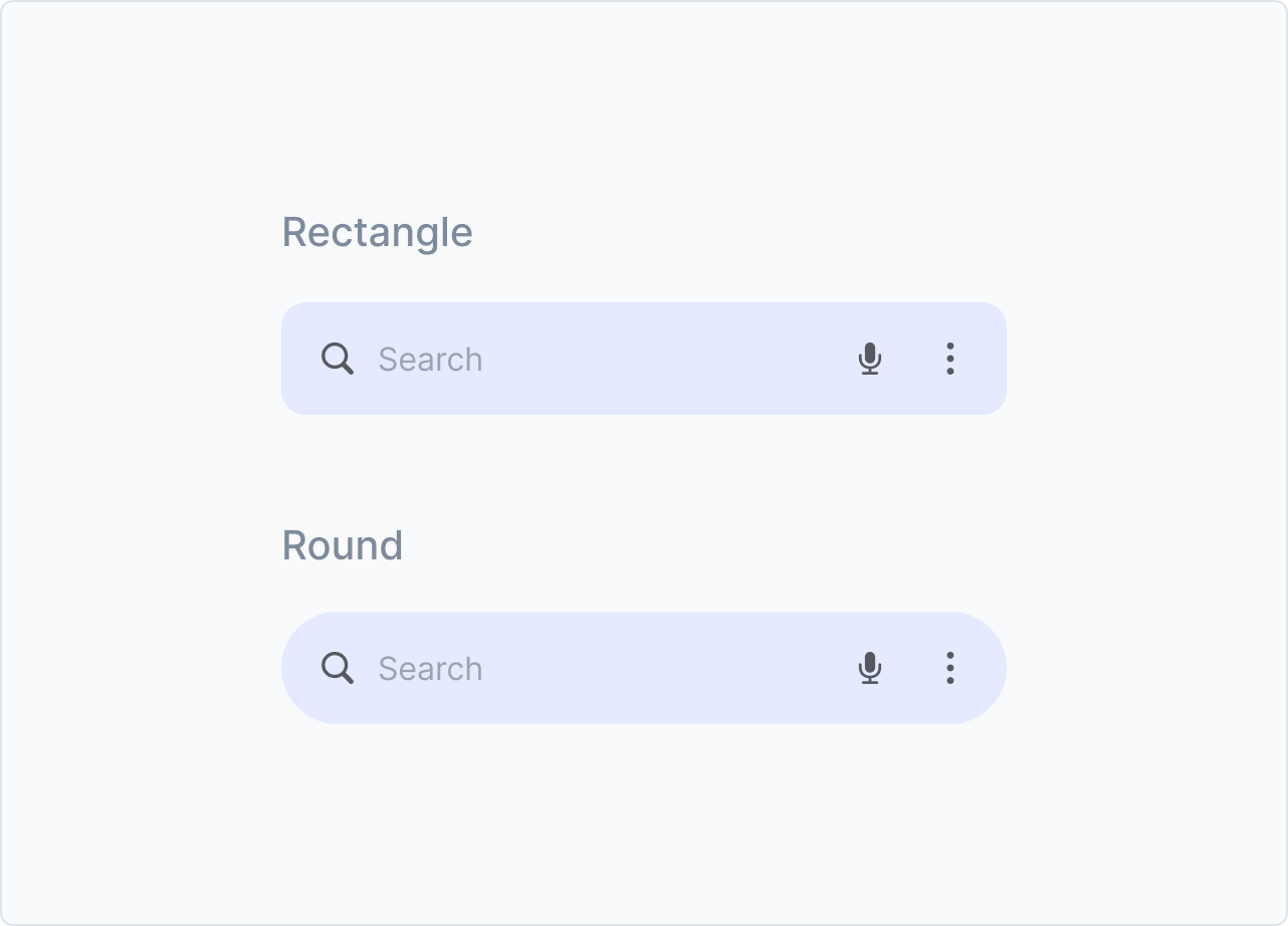
Unifying iOS and Android at the token layer surfaced a real tension: what do we do when the two platforms have different interaction patterns that users are deeply familiar with?

The clearest example was the search bar. Android users expect a visible focus state — a clear indicator that the field is active. iOS users typically just tap and type; a focus state feels redundant.

Our decision: the token layer stays unified. The component layer respects platform convention. Tokens govern color vocabulary. Components govern interaction behaviour. This is the right architectural split — and it maps directly to how Jakob's Law applies at a systems level.

iOS vs Android search component comparison
Principle Applied
Jakob's Law — users spend most of their time in other apps. Design to match the platform conventions they already know, even within a unified system.
06 · Component Library

Built for reuse.
Sourced from evidence.

Component selection wasn't based on guesswork. We cross-referenced Material 3, iOS Human Interface Guidelines, and Tencent's design system — then filtered against our own historical audit of what components appeared most frequently across the 30 apps. The result is a set of high-reuse, low-ambiguity building blocks that covers the full range of interaction patterns without over-engineering.

🔷 Basic UI 5
Button</>
FAB</>
Divider</>
Chip (Tag)</>
Image</>
🧭 Navigation 5
NavBar (Top Bar)</>
TabBar (Bottom Nav)</>
Tabs</>
Segmented Picker</>
Step Indicator</>
✏️ Input 11
Checkbox</>
Radio</>
Search</>
Switch (Toggle)</>
Slider</>
Text Input</>
Text Area</>
Dropdown Menu</>
Wheel Picker</>
Date/Time Picker</>
Rate</>
📊 Data Display 8
Avatar</>
Badge</>
Cell</>
Swipe Cell</>
News</>
Progress</>
Pagination</>
Carousel</>
💬 Feedback 5
Action Sheet</>
Dialog</>
Notice Bar (Message)</>
Bottom Sheet (Modal)</>
Tooltips</>
📦 Others 6
Guide</>
Tutorial</>
Event Card</>
Ads</>
Winback Offer</>
Landing Page Template</>
Platform-Specific Components

Same function,
different form.

Most components share one unified design. But a handful carry enough platform-native meaning that forcing a single visual would break user expectations. For these, we made a deliberate call to maintain separate iOS and Android variants within the same system — same token layer, different component expression.

Segmented Picker
iOS Segmented Control is a pill-shaped, filled selection. Android's equivalent is a more linear, outlined chip-group. Using the wrong one reads as "ported."
iOS variant
iOS Segmented Control
Android variant
Android Chip Group
Search Bar
Android users expect an explicit focus state when the field is active. iOS users tap directly and begin typing; a focus state feels redundant and creates noise in a familiar iOS context.
No focus state
iOS Direct input
With focus state
Android Focus indicator
Switch (Toggle)
iOS switch is larger, with a white thumb and smooth slide. Android's M3 switch uses a smaller thumb that grows on press, with a distinct track shape. Both are instantly recognizable — but only on their home platform.
iOS switch
iOS UISwitch
Android switch
Android M3 Switch
App Store / Play Store Event Card
App Store and Google Play have distinct promotional card formats and aspect ratio requirements. Using one format on both stores risks rejection or poor display in the app's storefront listing.
App Store format
iOS App Store Event
Play Store format
Android Play Store Event
07 · Deliberate Constraints

What we chose
not to build.

The instinct with design systems is to be comprehensive. We made the opposite call. A system that over-specifies becomes a ceiling, not a foundation — a lesson learned the hard way from our first-generation systems.

Out of Scope
Dark Mode
Our 30 apps are stylistically diverse — some are dark-mode-first, some have individual dark pages within a light app. Baking dark/light into the global system would force false consistency. Designers would either inherit wrong values or fight the system entirely.
Lesson from v1: Our first-gen systems included dark mode tokens. Designers found them constraining on apps with non-standard mode logic and bypassed them entirely — defeating the purpose.
Out of Scope
Shadows & Effects
Visual effects like shadow and blur are highly style-dependent. A food delivery app and a fintech dashboard need fundamentally different elevation languages. Standardizing these would constrain UI variety in ways the creative director explicitly did not want.
Design principle: Global systems should govern shared logic, not aesthetic personality. Effects belong to the product, not the system.

"A system that controls too much becomes a ceiling. We built a foundation — then got out of the way."

08 · Results

What changed.

5 new apps launched cross-platform from day one. VQA issue rate down from ~95% to ~80%. Engineering on iOS and Android now reference identical color names.

VQA Issue Rate — Before vs After System Deployment
Before
~95%
After
~80%  · spacing remains the open problem
"I don't need to ask what color value to use anymore."
Engineering · iOS team
"Switching from light to dark is just a token swap now."
Engineering · Android team
Adjacent Impact
The motion team — responsible for promotional videos and animations — reported that improved design-to-product fidelity directly reduced their revision cycles. When the product looks like the design, they can pull UI references without manual corrections.
09 · Reflection

What we'd do
differently.

01
Spacing should have been in scope
VQA data shows spacing is now the most frequent failure point. Color and typography were solved — but without a shared spacing token system, handoff inconsistencies persist. In the next iteration, spacing tokens are the priority.
02
Bring engineering into the token architecture debate earlier
We spent nearly three weeks debating Idea 1 vs Idea 2 between two designers. When we finally brought engineering into the conversation, their priorities — reuse rate, simplicity — clarified our decision within days. That conversation should have happened in week one, not week three.
03
The constraint strategy was the right call
Excluding dark mode and effects from the global system felt like a limitation at the time. In retrospect, it was the decision that made the system actually adoptable. Products with unique visual needs used the token foundation and built their personality on top. This is what a platform should feel like.

Next Project

EdTechLive — Personalized Instructional Strategies

View Project