NOAA
Live Weather Radar
Rebuilding a broken weather app into a life-safety companion — and earning a spot on PCMAG's Best Weather Apps 2025.
App Store rating — up from 4.4, after the redesign shipped.
↑ significant subscription uplift · ~30% download spike · PCMAG Best Weather Apps 2025
The app gives up to date info that affects my specific location. Exactly what I need when the networks just keep replaying the same news over and over.
— oolie p
Downloaded during Hurricane Milton, hours before potential landfall
This review captures exactly what this redesign was built to do — and what the original app failed at.
A product that lost trust
on three levels at once.
Hurricane tracking buried in 35+ interchangeable layers. Smoke layers showing nothing. Wind with color but no direction. Nielsen heuristics #1, #5, #9 — all violated.
Black screens on launch. A "Restore Purchases" button that triggered nothing. The product broke at the exact moment users needed it most.
Purchased ratings. A "50% off" promo that went from $9.99 to $6.99. Users noticed. One wrote: "I doubt the developer cares."
The company is based in Florida. Severe weather isn't a feature category — it's the reason people need the product at all.
Hurricanes are seasonal and geographically concentrated. How do you make a Florida-centric value proposition feel personally urgent to a user in California, Kansas, or Minnesota — year-round?
Everyone else designed
for weather curiosity.
Hurricane tracker lives in a separate workflow. Two navigation paths, two mental models — friction at exactly the wrong moment.
Hurricane data embedded deep in a general-purpose app with heavy ad load. Information-dense but cognitively overwhelming.
Broadcast-style TV-news experience. Users are observers watching the storm — not decision-makers planning around it.
We designed for protective action. Everything else followed from that.
Six screens.
One mental model.
Before any feature list — users see a real, active threat in their specific region. California gets wildfire alerts. Oklahoma gets tornado watches. Florida gets hurricane warnings. Not a welcome screen. A breaking news card, generated by remote config matching location to alert type.
The four-screen flow builds a chain of justified asks: threat → location permission → notification permission → subscribe. Each step's ask is earned by the step before it. Subscription stops feeling like a product decision — it feels like completing the act of protecting yourself.
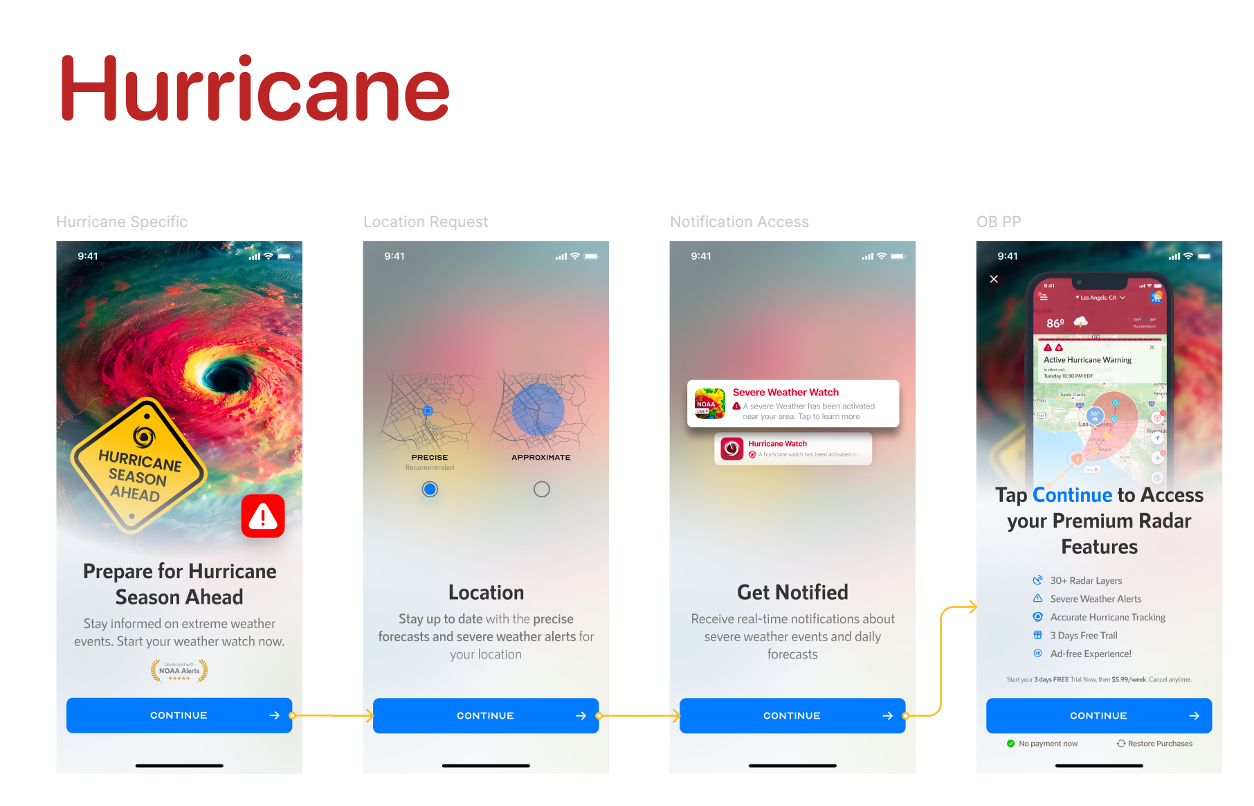
Competitors show a static snapshot: here is where the hurricane is. We built a horizontal time scrubber — drag across waypoints and the map cone, category, wind speed, and movement update in real time.
The design answers a different question: not "where is it now?" but "if I leave tomorrow morning, what will conditions look like?" Color-coded waypoints (red → Cat 3, orange → Cat 2, yellow → Cat 1) communicate intensity change over time without requiring users to read labels.
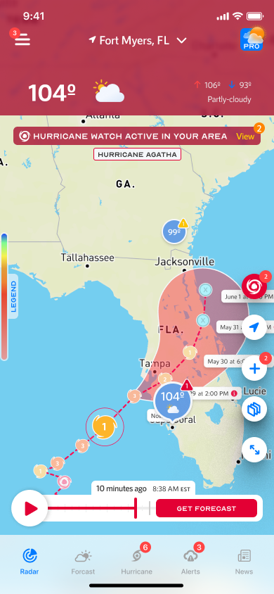
The Alerts page has two tabs: Current Location and Favorite Location. Alerts are grouped by city — Tampa shows 3 active, Irvine shows 2. A user monitoring elderly parents in Florida while safe in Chicago now has an app worth paying for.
Alert detail pages embed the NHC Seven-Day Graphical Tropical Weather Outlook directly — the official chart, uninterpreted. Users in high-stakes situations see exactly what emergency managers see. Trust through transparency, not through translation.
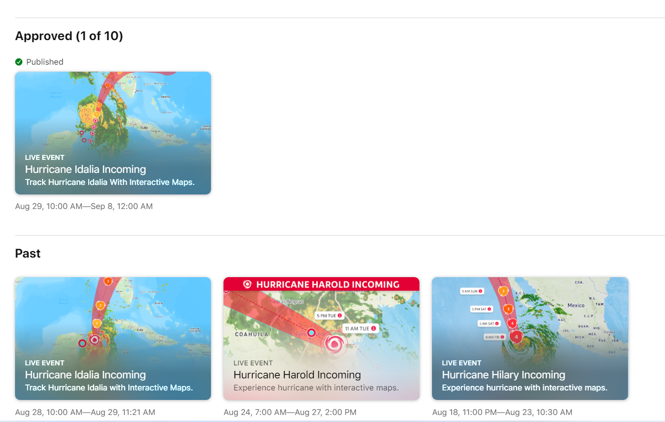
Using Apple's App Store Events feature, we built a hurricane-season promotion around the in-app track visualization: actual storm cones and paths, with copy written like a news alert. Users searching for weather apps during hurricane season encountered what looked like breaking news.
The creative was a direct extension of the product's visual language — urgency, specificity, action. Same vocabulary, applied to the top of the acquisition funnel.
Measurable trust, at scale.
Competitors designed for weather curiosity.
We designed for protective action.
The OB card couldn't be animated — every added MB impacts download conversion. That constraint forced a discipline: if you can't rely on motion to create urgency, the hierarchy, copy, and image have to do it alone. "Brace Yourself for the Incoming Heat Wave" works because it addresses the user directly. It assumes they're already in it.
The most valuable decisions in this project weren't about interface components. They were about which mental model to design for. Once that was clear, everything else followed.