Redesigning a broken
bedtime ritual
Users had a sleep app, but no sleep experience. I redesigned the full wind-down journey to turn scattered features into a coherent nightly habit, driving +61% in premium conversion.
subscription conversion lift — the headline result.
+30% trial starts · 70→90% task success · 4.5→7.2% paid rate · −22s per session
A product built around sleep
that couldn't feel like sleep
The app had strong features: curated soundscapes, detailed health data, premium content. But users weren't connecting the dots. They'd open a sound, dismiss an insight notification, and leave. The nightly ritual was broken before it could begin.
The wind-down layer
High-frequency, action-driven feature. Users interact pre-sleep, where cognitive load must be near zero. This is the premium entry point.
The morning layer
Complex information architecture, varied user needs. Users review sleep quality data after waking — with very different levels of interest in the detail.
The data told a story
about disconnection
"I just want to relax."
— Consistent user sentiment across tickle flow feedback & internal interviewsThat phrase captured everything. Users arrived with a simple, emotional need. The interface answered with friction, decisions, and labels that interrupted the very calm they came for.
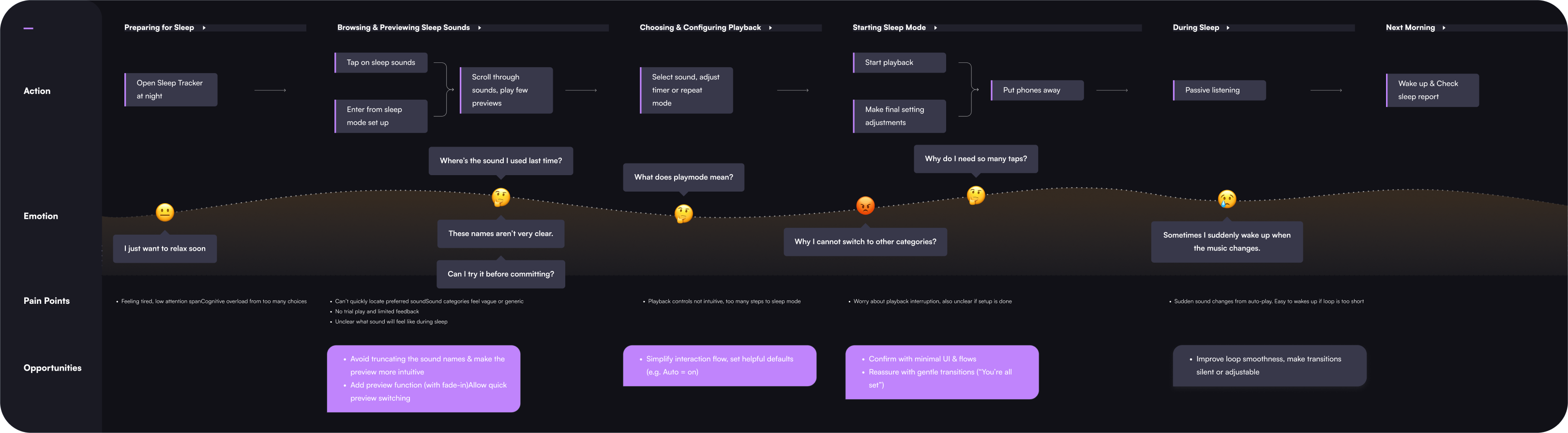
Mapping the Emotional Gap
User journey mapping revealed that frustration was progressive. Users arrived calm, and the UI systematically eroded that state across multiple friction points.
Two features.
Two approaches.
Recognizing that Sleep Sounds and Sleep Insights had fundamentally different user needs, I ran them as separate design tracks — each with a methodology matched to the problem type.
Linear, goal-oriented flow
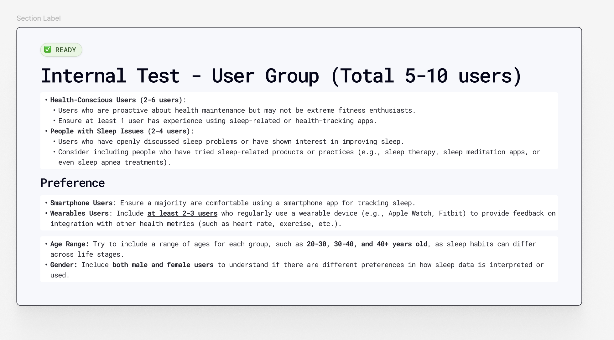
Pre-sleep context means cognitive load must be near zero. I designed 5 flow concepts, critiqued them with the design director using an evaluation matrix, then built 3 interactive Figma prototypes.
5 flows → critique → 3 prototypes → usability testing (n=9)
Hierarchical information design
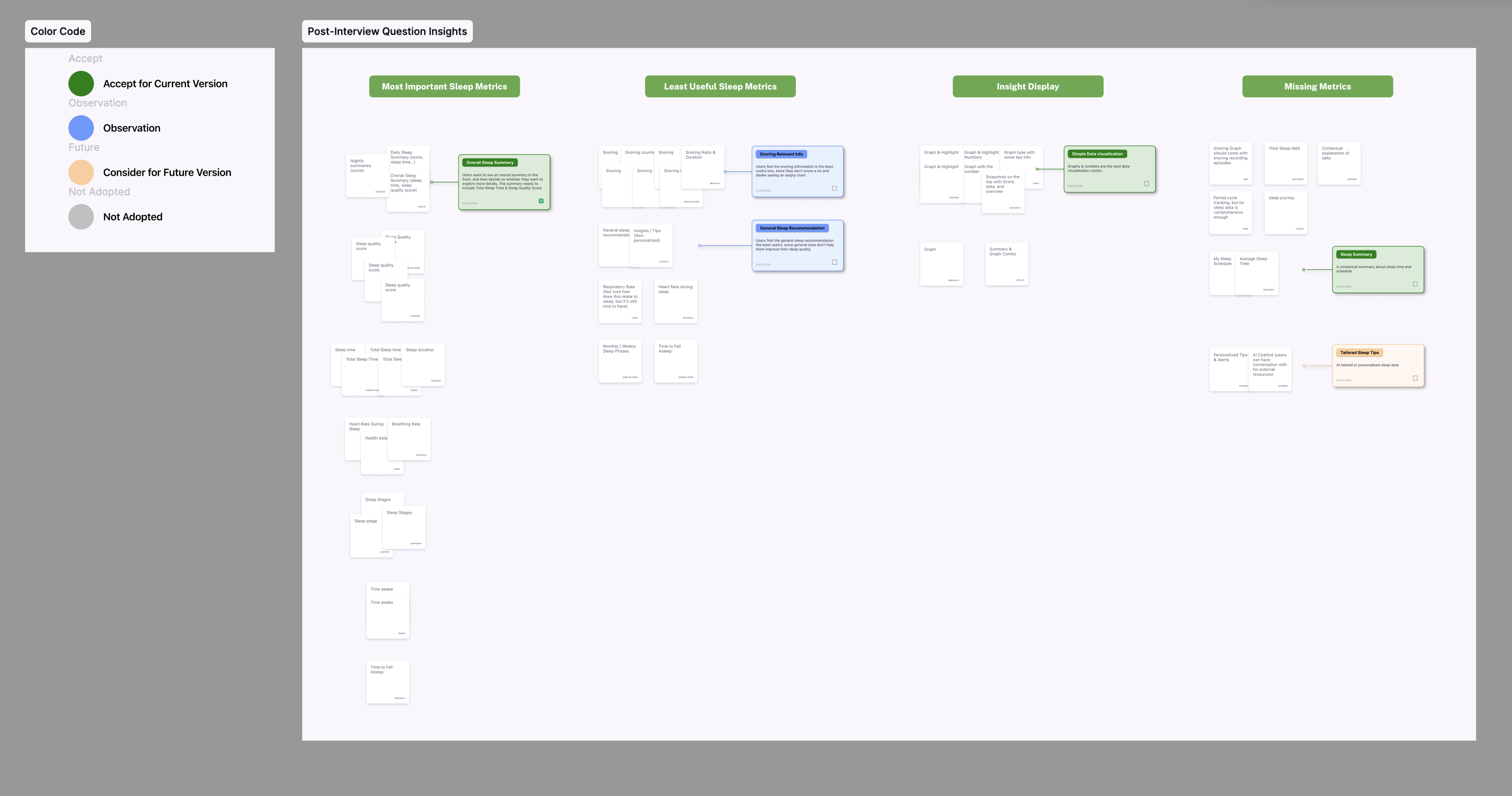
Morning reflection involves varied data needs. I used card sorting and qualitative interviews to surface which metrics users cared about most — and how they mentally categorized them.
Card sorting + interviews + visual preference testing (n=9)
Within-subjects design: Each of 9 participants tested 2 of the 3 Sleep Sounds flows, then completed the card sorting task. This controlled for individual differences and reduced comparative bias — critical with a small sample where personality variance would otherwise distort results.
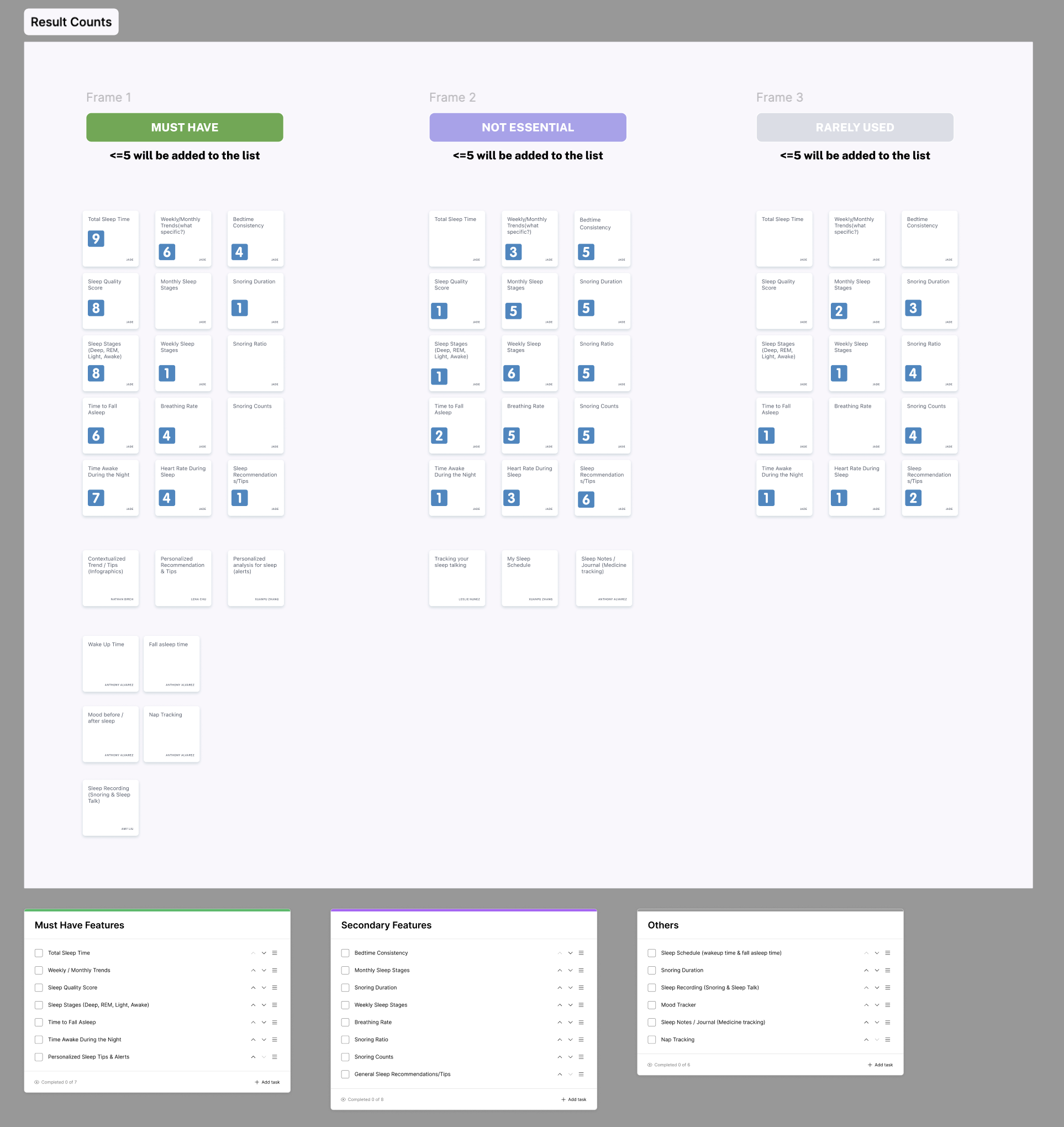 Card sorting (n=9) revealed a consistent mental model: users prioritized total sleep time, schedule, and quality score — and mentally separated detailed metrics as secondary.
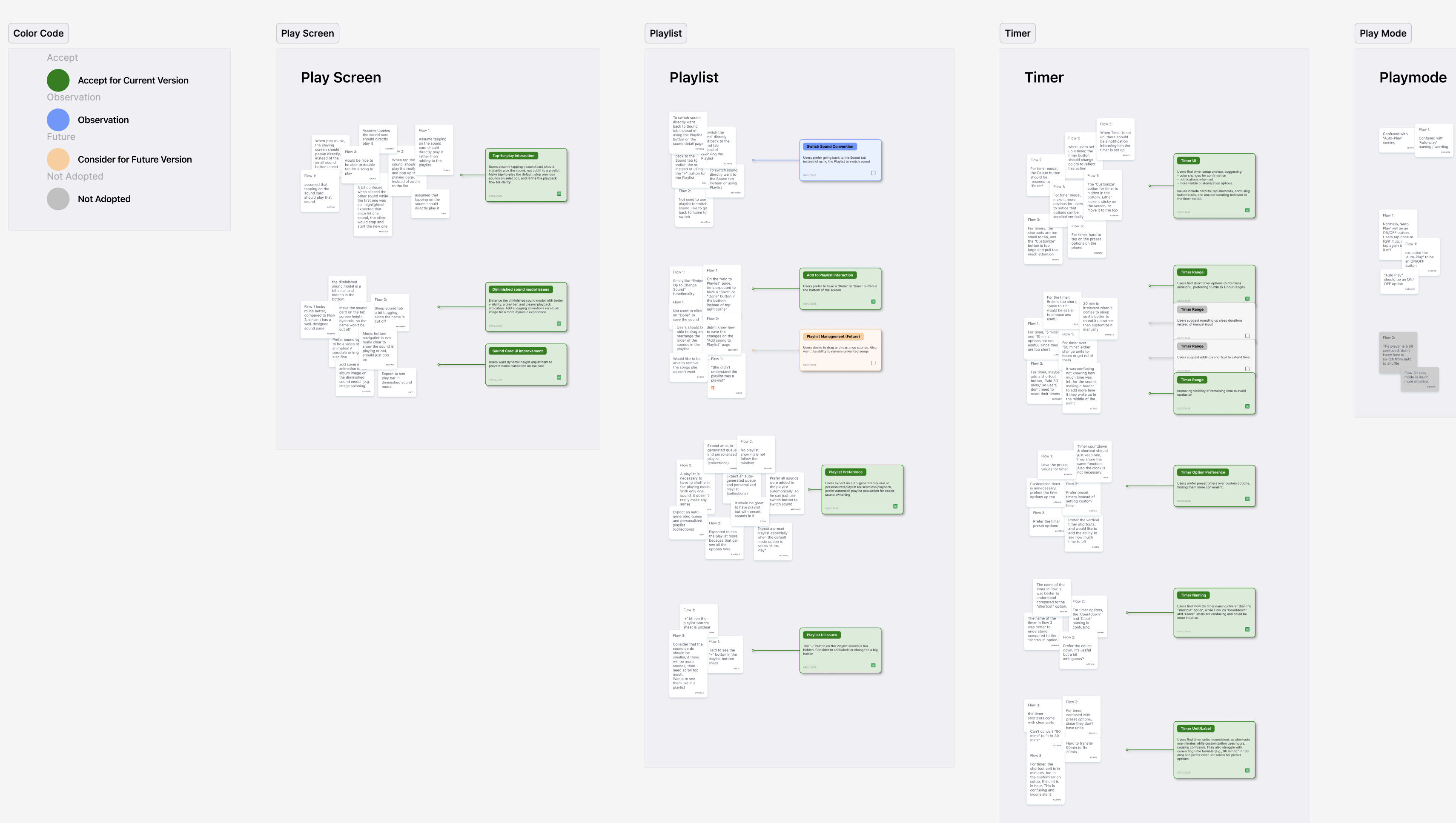 Affinity mapping across 9 sessions surfaced three dominant pain clusters: timer confusion, unclear playback state, and hidden premium content — each mapped to a distinct design intervention.
 Visual preference testing (n=9) showed a clear lean toward Flow 3's consolidated layout — scores validated the affinity map findings and gave the design rationale quantitative grounding.
Three flows tested.
One emerged clearly.
Each flow reflected a different navigation philosophy. Testing revealed not just which was faster — but why the intuitive answer was wrong.
Users manually add sounds to a blank playlist. Maximum control, maximum steps.
Select one sound from a category; system auto-generates a playlist. Fast, but ambiguous.
Consolidated panel: timer, playback mode, and queue in one view. Fewer screens, smarter defaults.
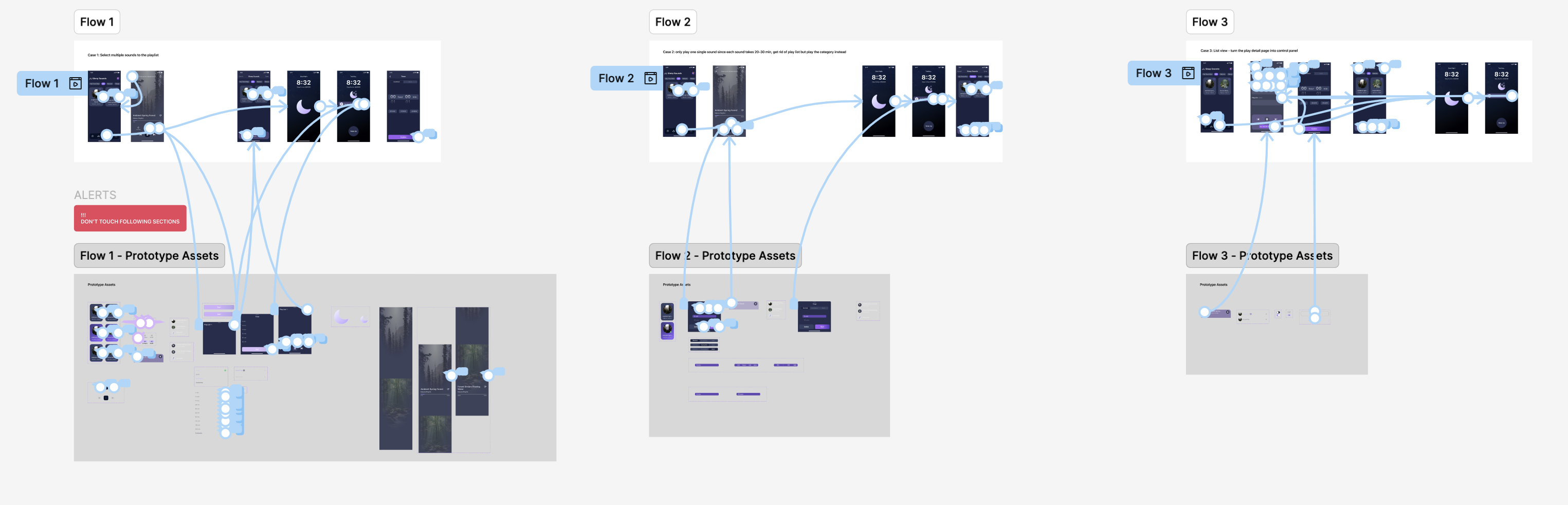
Flow 1 scored highest in post-test preference surveys among power users — but performed worst on actual task completion speed. At bedtime, stated preferences don't predict behavior. Flow 3 resolved this by applying Hick's Law: reducing the number of choices at the moment of peak fatigue while keeping advanced options accessible, not hidden.
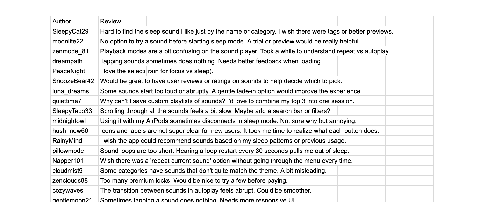
What users actually said
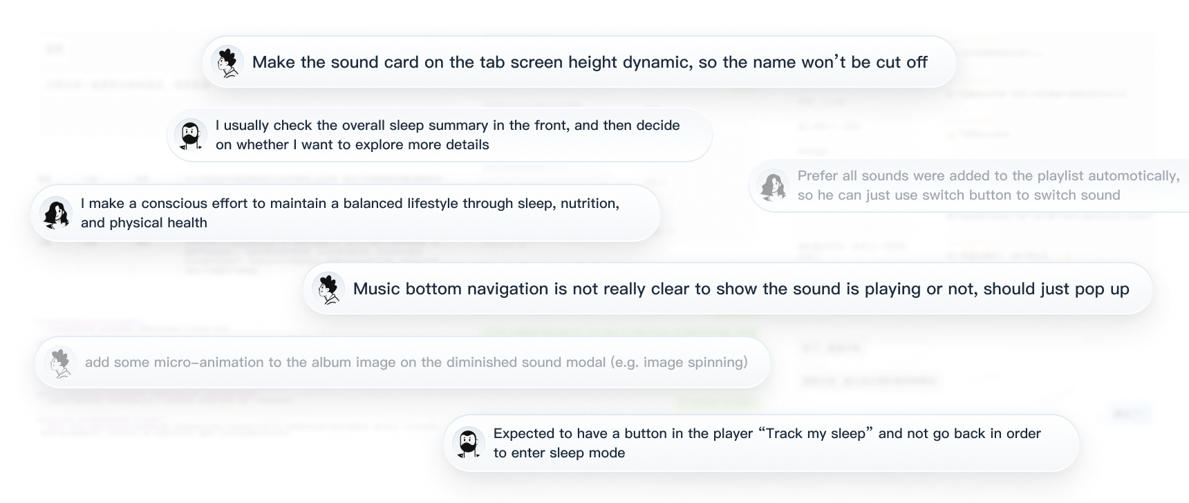 Interview synthesis: users arrived tired and ready to relax, but the interface demanded cognitive effort before they could start.
 Open-ended responses clustered around three themes: navigating the sound library, configuring the timer, and tracking state uncertainty.
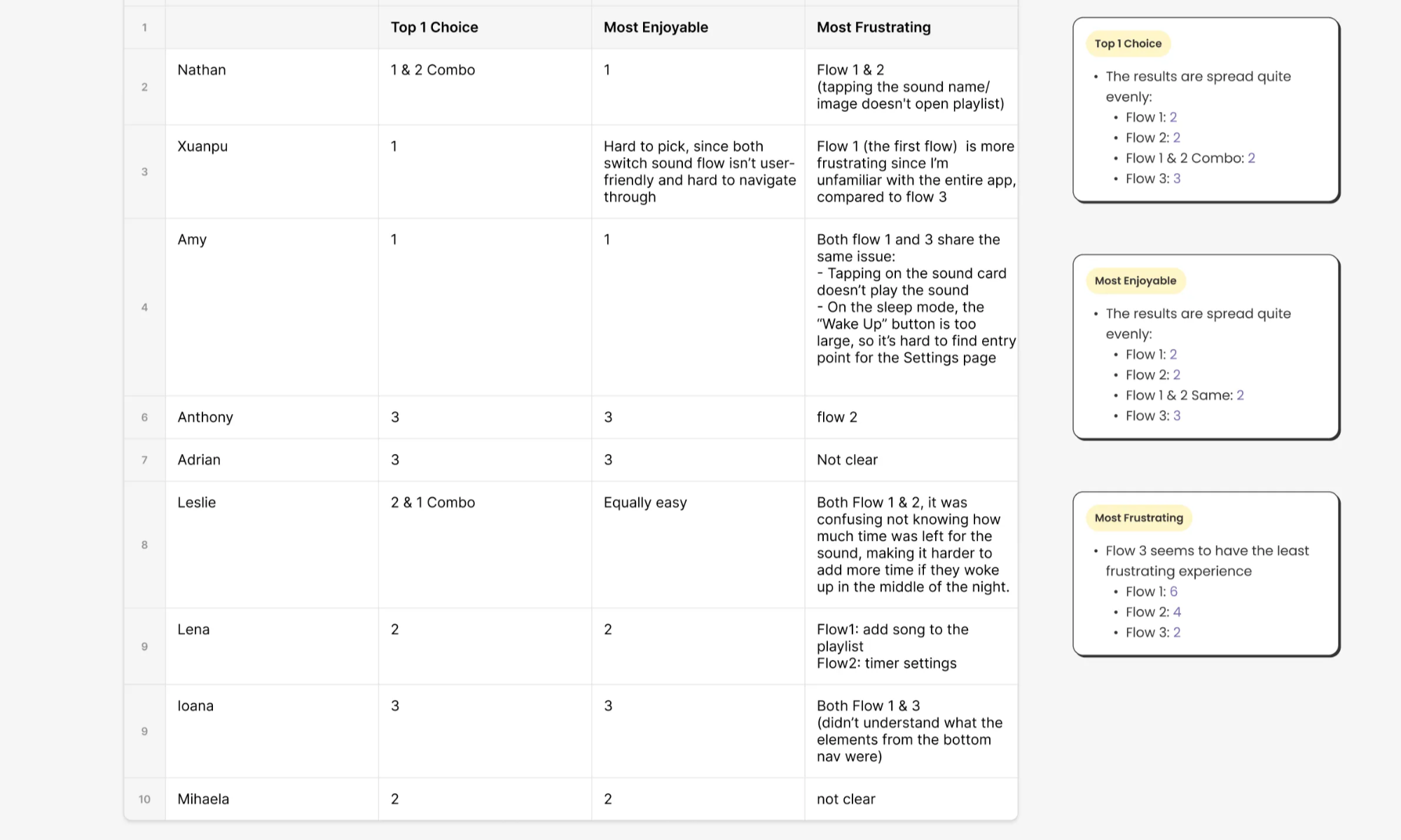 Coded analysis: timer confusion and playback uncertainty account for over half of all negative mentions across 9 sessions.
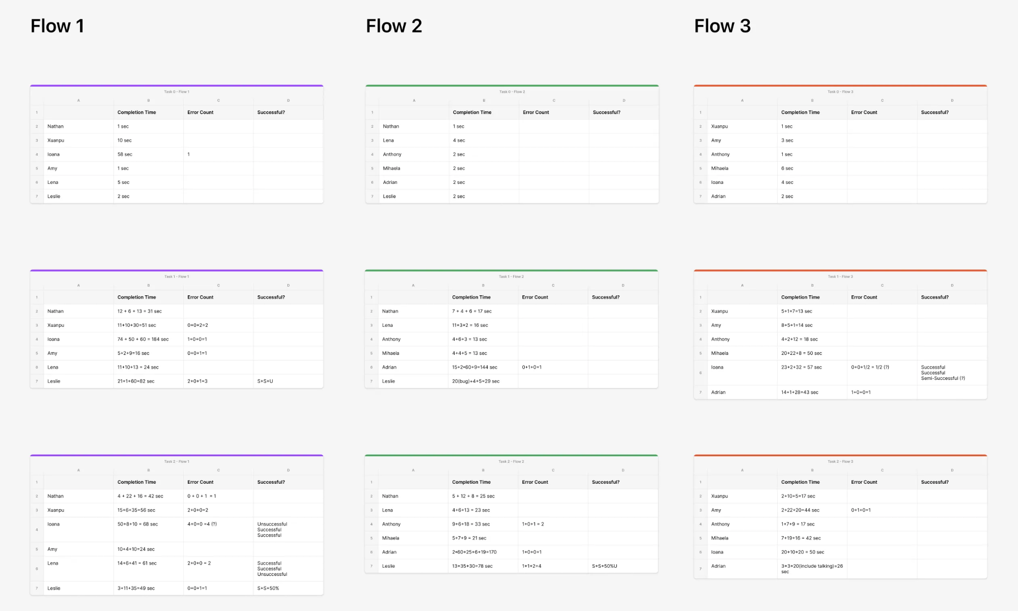 Quantitative results: task completion speed and error rates across all three flows — the performance gap between Flow 3 and Flow 1 is starkest at step 2.
 Insight page feedback: users wanted a clearer hierarchy — glanceable summary first, detailed breakdown on demand. Card sorting guided the restructure.
The frameworks that
anchored the decisions
From friction
to flow
The redesign centered on two convictions: Sleep Sounds should require fewer decisions, and Sleep Insights should surface fewer — but more meaningful — data points.
Before → After
A sound library that feels like a record crate
Category-based navigation with auto-generated queues means users tap once and drift toward sleep — without managing a playlist.
- →Tap-to-play as default; not add-to-playlist
- →30s preview for free users → natural premium pitch moment
- →"Track My Sleep" CTA embedded in player view
- →Screen auto-dims in sleep mode
Data that answers instead of overwhelms
Card sorting surfaced a clear hierarchy: total sleep time, schedule consistency, and quality score — in that order. I rebuilt the page as a progressive disclosure system.
- →Score-first layout — single number that sets morning tone
- →"Last night" sound summary closes the feedback loop
- →Deep data accessible but not defaulted to
- →Weekly/monthly trends for data-driven users
Numbers that validated
the ritual
The post-launch metrics told a coherent story — not just individual feature wins, but evidence that the end-to-end experience was working as a connected system.
The ~30% increase in Trial Start Rate shows users weren't just completing the task faster — they were choosing to go deeper into the premium experience. That's habit formation, not just usability improvement.
What I carry
forward
Not general lessons. Things I learned specifically from the moment this project challenged me.